
ManulifeMOVE
MY ROLE: End-to-End UX/UI Designer
RESPONSIBILITIES: Research • User Testing • Product Strategy • User Flows • Wireframing • UI Design • Stakeholder Alignment • Validation
PLATFORM: Mobile App
PROJECT OVERVIEW
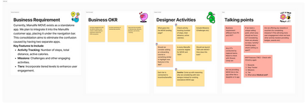
ManulifeMOVE is a digital health and wellness program integrated into the main Manulife customer app, evolving from a standalone product into a more connected customer experience. The platform introduces a tier-based benefits system, combined with activity tracking, rewards, and missions to encourage healthier lifestyles. It enables customers to understand their membership tier, discover curated partner benefits, and seamlessly access benefit information within the app.
PROJECT GOALS
Business Goals
-
Consolidate MOVE into the CWS ecosystem
-
Increase user engagement
-
Improve mission participation
-
Strengthen retention
-
Create a scalable foundation for future wellness initiatives
Design Goals
-
Simplify the overall experience
-
Improve discoverability of key features
-
Increase motivation through rewards and progression
-
Create meaningful connections between wellness activities and benefits
-
Support existing user habits without introducing unnecessary friction
DESIGN PROCESS
EMPATHISE
Understand user needs and feelings through research
DEFINE
Clearly state problem based on insights
IDEATE
Generate creative solutions to the defined problem
DESIGN
Create visual designs and interactive models of solutions
TEST
Collect user feedback to imporve and refine designs
RESEARCH & DISCOVERY
Before exploring solutions, I wanted to understand how users expected these wellness experiences to work together.
Research Activities
-
Usability Testing
-
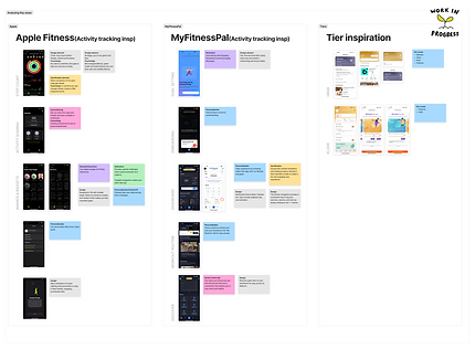
Existing Product Audit
-
App Review Analysis
-
Stakeholder Discussions
Key Insights
The research uncovered an interesting pattern. Users wanted to stay active, earn rewards, understand benefits, and track progress. The challenge wasn't feature discoverability alone. The challenge was creating meaningful connections between those experiences.

USER TESTING
User testing 1: MOVE Membership study
-
25 Users
-
Singapore
-
Age 26–52
Objective:
To evaluate whether users:
-
Understand the activity tracker, rewards, and missions flow
-
Find the flows and copy intuitive and aligned with expectations
-
Expects rewards, missions, and member benefits to be connected even though right now, they work separately
-
If they expect anything else in the flow
Task 1: Imagine you are an Essential tier member and you want to check your membership card and find out more on how to upgrade to next tier. Please show us where would you look for the information.

Please indicate your level of agreement with the following statement: "It is easy to find my membership card”
Task 2: Next, you would like to explore the partner benefits for all membership tiers. Please show us how would you do so

Please indicate your level of agreement with the following statement: “It is easy to find the benefits across all tiers"


Task 3: Lastly, you are keen to find out more on how you can redeem your benefits. Please show us how you would you find the information.

Please indicate your level of agreement with the following statement: "It is easy to find the information on how you can redeem your benefits"

Comments
-
very easy to find (3)
-
The big green button was very obvious and clear. Maybe a text indication might help, e.g. "Membership: Essential" within the green button, but this doesn't feel absolutely necessary. the button as is, is pretty clear (4 users)
-
Prominently coloured header and/or banner for easy navigation is immensely helpful
-
The logo and wording is loud and clear, which allowed me to find it easily. (1 User)
-
The information is detail enough. And I can found the relavant info easily (1 user)
Thoughts
💭 since this is a new feature, when the user opens the app once it’s released, have a focus bubble to let them know about it (1 user)
💭 I like the green button with the text, "Membership", which made finding the ither tiers a tad easier. i would replace the photo behind the button with the illustration in the previous version that I just tested.
Were you able to find information on how to upgrade to the next tier?

Which of the following items do you find most useful? Please rate each item based on its usefulness to you. (1 = Not at all useful, 5 = very useful)

User testing 2: MOVE Activity tracker, Missions & Rewards
Objective:
-
Understand Entry Points for Rewards and Missions
Observe how users locate and access the rewards and missions section.
Evaluate whether the entry point is intuitive and easily discoverable. -
Identify How Users Access the Activity Tracker
Determine if users click the “Connect” button for the activity tracker on the homepage or accessed through the MOVE section. -
Evaluate Flow and Copy
Assess whether the user flow and interface copy are intuitive, clear, and aligned with user expectations. -
Explore Additional User Expectations
Identify if users expect any other steps, features, or guidance within the flow that are currently missing.
Task 1: Imagine you are exploring the Missions feature in the Manulife SG app. Show how you would find and take part in the 30-Day Wellness Mission.
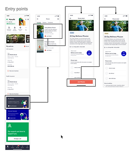
Please indicate your level of agreement with the following statement: "It is easy to find missions on Manulife SG app"

Task 2: You want to explore rewards in the Manulife SG app and decide to claim reward from Garmin. Please show us how you would complete the redemption process.

Please indicate your level of agreement with the following statement: "It is easy to find rewards on Manulife SG app"

Task 3: Now you would like to check activity tracker on the Manulife SG app to view the number of steps you have walked and the calories you burned. Please show us how you would access this information.

Please indicate your level of agreement with the following statement: "It is easy to find informatioon about step count and calories burned on the Manulife SG app"

KEY FINDINGS & DESIGNS
Membership experience
Finding:
Membership was a newly introduced feature within the MOVE ecosystem. While users successfully discovered the feature, several participants expected additional context around tier information and progression.
Validation:
-
21 out of 25 participants successfully located membership information
-
Membership discoverability score: 3.91 / 5
-
Benefits discoverability score: 4.56 / 5
Design Decision
To improve clarity and first-time adoption:
Introduced a first-time onboarding prompt highlighting the new feature

- Increased visibility of membership information from the homepage
- Added a "New" label on the navigation bar for MOVE

On click of "MOVE"page opens and shows membership tier on front page

Benefits Experience
Finding:
Users naturally explored benefits through both the Membership Card and MOVE navigation.
Validation:
-
Users successfully located partner benefits through both entry points
-
Users were able to compare benefits across different tiers
Design Decision
Maintained multiple access points to benefits. Benefits remain accessible through
Membership Card

MOVE Navigation

Benefits listing

Mission experience
Finding:
Although some participants suggested moving Missions higher on the homepage, task completion rates indicated that the existing placement was already effective.
Validation:
-
10 out of 12 participants successfully completed mission-related tasks
-
Mission discoverability score: 4.17 / 5
Design Decision
To improve clarity and first-time adoption:
Maintained the existing homepage placement.


Reward experience
Finding:
Rewards was one of the most discoverable features within the ecosystem. Some participants also associated rewards with wellness activities and tracking behaviour.
Validation:
-
11 out of 12 participants successfully located Rewards
-
Rewards discoverability score: 4.42 / 5
Design Decision
Maintained the current reward placement while identifying future opportunities to strengthen the relationship between rewards, missions, and wellness activities.


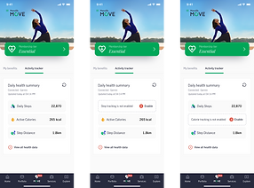
Activity tracker
Finding:
Participants naturally associated activity tracking with wellness experiences and expected it to live within MOVE.
Many users were already familiar with Apple Health and other fitness platforms.
Validation:
-
12 out of 12 participants successfully completed activity tracking tasks
-
Activity Tracker discoverability score: 4.58 / 5
Design Decision
Activity Tracker remained under MOVE.

MARKETING BOOTH
MOVE was presented through a marketing activation booth to gather feedback from real users.
This provided an opportunity to observe:
- First impressions
-
Membership understanding
-
Interest in missions and rewards
-
Overall perception of the ecosystem


CONCLUSION
The MOVE migration transformed a collection of wellness features into a connected ecosystem.
The redesign:
-
Improved discoverability across key experiences
-
Increased engagement opportunities
-
Strengthened relationships between activity, rewards, and membership
-
Created a scalable foundation for future wellness initiatives
-
Received positive feedback from users and stakeholders


